Monday, 10 December 2012

Playing Around

As I'm off uni ill at home at the moment I haven't been able to do much drawing/painting etc. I've been really bored so thought I'd just have a play around online at pixlr.com which is a photo editor a bit like Photoshop. In my research I've been looking at colour data so thought I'd experiment at how I could introduce this with the barcode theme I have thought about. 


I chose a black & white barcode image off Google as well as an image of a rose. I then used colour picker to select colours out of the rose petals and tried to represent these through the vertical strips of the barcode. I did the same for leaves of the rose into the coded numbers.

It's too early for me to say weather i'll start fully focusing on this idea alone but it's definitely something I'd like to revisit perhaps using my own photographs etc further down the line as colour data is something that interests me. 

Barcodes

So I've decided to start collecting barcodes, it suddenly hit me that they are literally everywhere on everything from magazines and books, food packaging, medication packaging, cosmetic packaging..you get the idea! Barcodes are an optical machine readable representation of data relating to the object to which it is attached and are made up of various vertical lines with a number code below. This may have potential.


Further Data Research

'Diamond Jubilee Bunting Infographic' by Jam
I came across this bunting online at spreadingjam.com and thought it was a fun and quirky way of representing data visualization. Jam says their inspiration came from all the 'naff' jubilee trinkets that were on the market. The bunting features a jubilee celebration heat map and a break down of the various jubilee memorabilia there is out there. This again has opened my eyes to another possibility of how you can represent data. 

Data Research

I have begun to research into artists who use data in interesting ways. Here below are a few that caught my eye. 


                      'Meshu' by Sha Hwang and Rachel Binx

Meshu is a data location project with a difference, the designers idea allows you to select and enter locations on a map or use check ins from foursquare to create your own unique pieces of jewelry - necklaces,earrings,cuff links. It represents where you are, where you've been and where you are going in a data form which is not only personal but wearable. Materials used are acrylic, wood, nylon, and silver. 

'Ten artists, Ten years' by Arthur Buxton & Derek Ruths, 2012

This is data art of 10 famous artists such as Monet and Matisse and their paintings in pie chart form.The color distribution of each pie represents the five most used shades in each painting. I love the way such classics have been given a contemporary edge through the use of data to create a completely different interpretation of the paintings.   

'Stem' by Diana Lange 

Again this is colour data in such an interesting and unusual form. Diana Lange builds stems from colour processing through a processing application she has created that searches for images on Flickr which then creates beautiful eye catching compositions based on the colour data of the image. 
She says:
 'This little program looks for photos on flickr by a given search word. Afterwards, the colors of the photos are analyzed. The color itself gets detected and how often each color is found. This data is the foundation of every stem. Each segment represents one color of the photo, the diameter shows the quantity. The cell resolution in all segments is based on the brightness of the color.'


New unit: Sampling

I'm excited to be starting the unit as I didn't do as well as I hoped in the last, 'origins'. For this unit i'm in fashion which is a textile world I've really been looking forward to giving a try. 
When I found out our project brief was 'data', my initial reaction was how it was such a broad theme which is good but can also be quite daunting. The first things that came to mind was graphs and tables, stereotypical   things you'd relate to data. However it wasn't until our first afternoon session in the studio when Nigel showed us a beautiful part of a tree that had been cut to expose it's hundreds of years of rings, that it became clear that data could quite literally be anything. 


We had 30 minutes using our opposite drawing hand (my left), a piece of A1 paper and a sharp pencil to draw the 200 rings of a tree trunk - 3mm spacing between the lines. I absolutely loved the outcome of this task as it created such beautiful unexpected lines that wobbled in places making it look really organic. I managed to reach 79 rings. 

Thursday, 15 November 2012

Digital Prints


I am really pleased with the outcome of my digital prints, inspired by maps, triangles etc all from the Liverpool trip. Once I had got to grips with photoshop, I found producing the designs enjoyable and understood how layering up various scanned in textures can really create effect. I found working with my challenging colour palette a lot easier digitally than I did with screen printing as I could as little or a lot of each colour quite easily. 

Screen Printing


These are a few of my screen prints, unfortunately I don't feel as though I've been successful in the print rooms. I've found it quite hard working with a screen full of so many small motifs therefore my repeating and lining up of designs got me in a bit of a muddle and put me off screen printing as it was so frustrating. I do like the actual motifs but think i'll focus more on digital print. 

Digital Print


We got given the opportunity to digitally print one of our designs we had done on photoshop for free. I chose a design inspired from some of the lines drawing I did on the way to Liverpool. I was quite pleased with outcome however it's made me want to experiment a lot more to produce some better designs. I love the idea of digitally printing as it's less time consuming than screen printing and can create a lot more possibilities design wise. 

Colour Inspiration


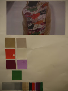
I chose this image out of a magazine as the colours are unusual however all work well together in a quirky way, it will be a challenge to work with these. 

Wednesday, 14 November 2012

Final Motif Designs


These are my final motif designs to go on to screen for screen printing. I just need to photocopy and to put it onto acetate. There's a mixture of hand drawn and illustrator produced motifs. It will be interesting to see how well I work with a screen that has quite a lot of designs on as i'm used to doing larger simpler-to- print designs. Bring on the challenge! 

Adobe Illustrator Motifs


Here are some of the motifs I digitally created on Illustrator. To say I don't have any experience with Illustrator, I found it quite easy to get to grips with and particularly liked using the different brush stroke tools to interpret how i'd use mark making by hand. I liked the fact you can play around with the size and repeat and rotate your motifs. I've been able to create some great unusual triangles.  

Hand drawn Motifs


 These are a few of my initial hand drawn motifs. I took inspiration from Jakob Koldings work I saw whilst in Liverpool as I love the strong lines the triangles he used had. I wanted to add a textural quality to the designs so I worked with Indian Ink and a tooth brush (bottom image), pastel and biro pen (middle image) and cut out triangles from textures I'd made on paper. I'd definitely like to explore more options I could potentially create using the shape of the triangle and other techniques.   

Mark Making Task


We were given 12 sentences such as 'A harsh black line meets a soft curved edge' and then had to interpret how we imagined this to be, on a small square of paper. I found this task exciting as I loved the freedom of being able to make all the different marks. I used biro pen, pastel and pencil. I think mark making is a really important aspect when it comes to designing as it allows you to explore and make positive mistakes. 

I decided to do a bit of research into artists who use mark making in an interesting way and came across Brice Mardens work. I love the simplicity of his work yet it's still interesting and textural. 

'Obama Letter' 2012 etching 35.6 x 35.6cm
                           'Etchings to Rexroth' 1996 etching & aquatint 203 x 172 mm
                          'Ten days' 1971 etching 30 x 21

Tuesday, 13 November 2012

Editing and Selecting for 'Drawing'

Here are a few photos of my work that I've begun to play around and experiment with from the trip to Liverpool. So far I've used a combination of drawing and collaging using my own photography and the work I saw and photographed on the trip.
This is one of the photographs I look on the way to Liverpool out of the coach window, I love the blurry rainy effect and I edited it in black and white to show the dullness of the weather that day. I then used oil pastels in bright colours to add a pattern inspired by Bridget Riley's work I saw in the Walker Gallery. To add texture I used yellow embroidery thread to represent where the yellow lines on the road would have been. 
 For this line drawing I drew in biro pen to create simple expressive lines that represent what I saw out of the coach window on the way to Liverpool, I wanted to try capture the movement of the journey. To mix it up and add a splash of colour I cut up bits of the photograph I took of Bridget Riley's 'Sea Cloud' from the Walker Gallery.  
This is also another photograph I took on the coach on the way to Liverpool. I cut 


Colour


Here is my colour wheel and different shades/tonal stripes I did. Although I did the same task at college it was good to refresh my mind and get back to basics. Getting the consistency of the gouache paint took time however I learnt that a little goes a long way! 

Wednesday, 26 September 2012

Micheal Raedecker 'Mirage'


On our day trip to Liverpool, I visited the Walker Gallery where I came across this piece by Amsterdam born Michael Raedecker - 'Mirage 1999'. I was instantly attracted to the use of texture and mixed media that turned the almost bleak and haunted landscape painting into something interesting and exciting. The combination of the flat painted surface with the tactile use of embroidery made me want to look more closely at the piece as it was unexpected from a distance that areas you'd expect to just be painted, were in fact embroided. In terms of scale and colour the piece was of a large scale with murky earthy tones that all blended well together. Viewing this piece definitely confirmed the fact I enjoy and admire the use of mixed media as it adds more depth and texture to work and hopefully I will be experimenting in this way myself soon. 

Snaps From Liverpool Trip