Thursday, 15 November 2012
Digital Prints
I am really pleased with the outcome of my digital prints, inspired by maps, triangles etc all from the Liverpool trip. Once I had got to grips with photoshop, I found producing the designs enjoyable and understood how layering up various scanned in textures can really create effect. I found working with my challenging colour palette a lot easier digitally than I did with screen printing as I could as little or a lot of each colour quite easily.
Screen Printing
These are a few of my screen prints, unfortunately I don't feel as though I've been successful in the print rooms. I've found it quite hard working with a screen full of so many small motifs therefore my repeating and lining up of designs got me in a bit of a muddle and put me off screen printing as it was so frustrating. I do like the actual motifs but think i'll focus more on digital print.
Digital Print
We got given the opportunity to digitally print one of our designs we had done on photoshop for free. I chose a design inspired from some of the lines drawing I did on the way to Liverpool. I was quite pleased with outcome however it's made me want to experiment a lot more to produce some better designs. I love the idea of digitally printing as it's less time consuming than screen printing and can create a lot more possibilities design wise.
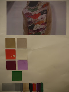
Colour Inspiration
I chose this image out of a magazine as the colours are unusual however all work well together in a quirky way, it will be a challenge to work with these.
Wednesday, 14 November 2012
Final Motif Designs
These are my final motif designs to go on to screen for screen printing. I just need to photocopy and to put it onto acetate. There's a mixture of hand drawn and illustrator produced motifs. It will be interesting to see how well I work with a screen that has quite a lot of designs on as i'm used to doing larger simpler-to- print designs. Bring on the challenge!
Adobe Illustrator Motifs
Here are some of the motifs I digitally created on Illustrator. To say I don't have any experience with Illustrator, I found it quite easy to get to grips with and particularly liked using the different brush stroke tools to interpret how i'd use mark making by hand. I liked the fact you can play around with the size and repeat and rotate your motifs. I've been able to create some great unusual triangles.
Hand drawn Motifs
These are a few of my initial hand drawn motifs. I took inspiration from Jakob Koldings work I saw whilst in Liverpool as I love the strong lines the triangles he used had. I wanted to add a textural quality to the designs so I worked with Indian Ink and a tooth brush (bottom image), pastel and biro pen (middle image) and cut out triangles from textures I'd made on paper. I'd definitely like to explore more options I could potentially create using the shape of the triangle and other techniques.
Mark Making Task
We were given 12 sentences such as 'A harsh black line meets a soft curved edge' and then had to interpret how we imagined this to be, on a small square of paper. I found this task exciting as I loved the freedom of being able to make all the different marks. I used biro pen, pastel and pencil. I think mark making is a really important aspect when it comes to designing as it allows you to explore and make positive mistakes.
I decided to do a bit of research into artists who use mark making in an interesting way and came across Brice Mardens work. I love the simplicity of his work yet it's still interesting and textural.
'Obama Letter' 2012 etching 35.6 x 35.6cm
'Etchings to Rexroth' 1996 etching & aquatint 203 x 172 mm'Ten days' 1971 etching 30 x 21
Tuesday, 13 November 2012
Editing and Selecting for 'Drawing'
Here are a few photos of my work that I've begun to play around and experiment with from the trip to Liverpool. So far I've used a combination of drawing and collaging using my own photography and the work I saw and photographed on the trip.
This is one of the photographs I look on the way to Liverpool out of the coach window, I love the blurry rainy effect and I edited it in black and white to show the dullness of the weather that day. I then used oil pastels in bright colours to add a pattern inspired by Bridget Riley's work I saw in the Walker Gallery. To add texture I used yellow embroidery thread to represent where the yellow lines on the road would have been.
For this line drawing I drew in biro pen to create simple expressive lines that represent what I saw out of the coach window on the way to Liverpool, I wanted to try capture the movement of the journey. To mix it up and add a splash of colour I cut up bits of the photograph I took of Bridget Riley's 'Sea Cloud' from the Walker Gallery. This is also another photograph I took on the coach on the way to Liverpool. I cut
Colour
Here is my colour wheel and different shades/tonal stripes I did. Although I did the same task at college it was good to refresh my mind and get back to basics. Getting the consistency of the gouache paint took time however I learnt that a little goes a long way!
Labels:
colour,
colour wheel,
gouache,
shades,
tones
Subscribe to:
Comments (Atom)


